If you want to make designing an ecommerce website easy and fast, our top recommendation for the best ecommerce platform is Shopify. It has great security and tons of pre-made themes, and new users can try it for 14 days free, no credit card required.
Designing an ecommerce website is just as important as writing the copy or marketing the products. A good site will make it easy for users to browse products, talk to customer service, and finalize their sales at checkout. But, there are right ways and wrong ways to design a site. In this guide, we’ll break down the best practices for designing a great ecommerce website, and the biggest pitfalls you should avoid.
The 6 Best Ecommerce Platforms For Ecommerce Website Design
Trying to design an ecommerce website is a lot easier if you choose the right platform. That’s why we’ve spent hours researching the best platforms out there to help you choose the right one based on what you’re hoping to achieve. You can check out the full review of our top recommendations here.
- Shopify – Best all-around ecommerce platform
- Zyro – Best price for a full online store
- Wix – Best for stores with fewer than 100 products
- BigCommerce – Best for large inventories
- Squarespace – Best for cornering a niche market
- Bluehost – Best for WordPress users who want to sell online
What is Ecommerce Website Design?
Ecommerce website design, put simply, is designing an online store website in a way that makes it easy for people to buy things and creates an overall positive user experience.
Having a good design is important for any website because it takes most people less than a second to decide whether they like a site. But, with ecommerce website design, it’s especially important for a site to be easy to navigate and to be attractive because that will determine whether or not the business is successful.
When looking at ecommerce specific design, there are also a few extra design elements that need to be considered. Building trust by creating the right sections and adding the right logos, badges, and colors is important. And, the design needs to reflect the branding of the products, but without becoming messy.
The goal, and the challenge, of ecommerce website design, is to create something aesthetic that compliments the products being sold, while still functioning successfully and being attractive to users.
How Ecommerce Website Design Works
When you’re looking at designing an ecommerce website, there are three routes you can choose:
For most people, using a template is the best option.
Let’s break down these three options and see what each one involves.
Using a Template
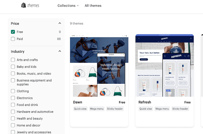
Most ecommerce platforms will have templates included when you sign up and set up your store. For example, one of our top recommendations, Shopify, offers users almost one hundred themes to choose from, catering to different types of stores and different industries.
You can browse through the themes and then choose the one that works for your brand and customize it. This is a great option for anyone who is limited in coding experience.
You’ll still get to add all the important design elements we talk about in this guide without having to worry about messing up code or a slow-loading website.
And, especially if you use a good platform like Shopify, you can add plugins for all the extra features you like so it’s easy to create a design that’s personalized to your brand.
Paying a Designer
If you have a big budget, your next option is to pay a designer.
They can either help you customize a template for the ecommerce store, or you can pay them to build a store from scratch and add code. This option is great if personal branding is really important or if you want lots of complex features.
However, due to the complicated nature of ecommerce sites (setting up secure payment processors, adding different currencies, etc) be prepared for the cost of hiring a designer to grow quickly.
It’s a good way to save time, but it will be a lot more expensive than just using a theme from an ecommerce platform.
Creating Your Own Site
If you really want complete control over your ecommerce website design, you do have the option of creating your own website from scratch.
However, this will be extremely difficult unless you are a web designer, and you truly understand coding. An ecommerce store is more complicated than a regular site – because money is involved, and there is a certain standard of safety and functionality that has to be programmed into the design.
You should only consider this route if you are experienced in web design and you need to create something unique. Bear in mind that if you do create and design your own site from scratch, you then need to figure out how to connect it to ecommerce features like payment processors.
Realistically, you’re much better off using a platform like Shopify, and then customizing as you go.
Strategies for Better Ecommerce Web Design
When you’re designing any website, there are some things you need to take into consideration. This includes things like site loading speeds, colors, site mapping, link-building, and graphics.
But, when it comes to ecommerce web design, there are a couple of extra things you’ll need to consider because you need to make security a priority and make the user journey simple.
Here are some of the things you should focus on when designing an ecommerce website:
Building Trust
If you use a platform like Shopify, it’ll make your life a lot easier, because a lot of safety features like paywalls and SSL certificates will be built in. When it comes to security features, Shopify has a great reputation and can help add the right features and display the right security badges.
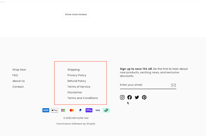
Another way that you can build trust is by creating pages that tell people about the brand, and the team behind it, including photos. You should also make sure you have a privacy policy and terms and conditions clearly displayed in the footer, and that you make any shipping or return instructions obvious and easy to find.
UX
Because ecommerce websites tend to be really complicated with lots of pages and product categories, you want to make it easy for people to navigate the site.
You should make a sitemap on paper first before you set about customizing your design. You’ll need to know how many pages you want to add, where each page is going to link to, and how to connect them all to each other.
Once you’re clear on which pages you are creating, what goes where, and how you need to display them, it’ll be easier for you to create a design that makes sense and that keeps your audience flowing through the sales funnel all the way to making a purchase.
Everything that needs to be navigated or clicked should be clearly labeled with things like buttons. You should also include a search bar and both a header and footer menu so users can easily find what they are looking for.
Site Speed
With any website, loading speeds are important. But, when it comes to ecommerce sites, they are more important than ever because you’ll have lots of products with images that need to load fast. The audience will leave a page if the product they want to see doesn’t load fast enough, losing you the sale.
When you create your design, you want to remove any unnecessary code, compress images to the perfect size, and consider using a caching plugin to help keep things as fast as possible.
If you use a theme, many platforms will be able to point you in the direction of a lightweight theme with faster loading times (like Shopify does with Dawn.) You can also use a free tool called Test My Store Speed that will help you test your ecommerce website speed so you can see where there’s room for improvement.

Examples of Ecommerce Website Designs That Work
If you’re not a professional designer, you might be struggling to know where to start.
Let’s take a look at some examples of ecommerce websites that have great designs and analyze what they’re doing right:
1. Harper Wilde
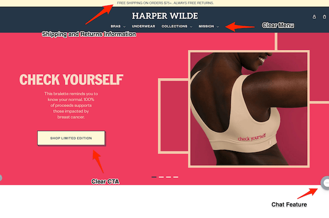
You can see in the screenshot that they have a clear menu, and buttons that are easy to find and that give a clear CTA, and they build trust straight away by adding a guarantee in the top banner.
Harper Wilde is also a Shopify site, showing that you can still design a unique and attractive website on the platform using a theme.
2. Pop Chart
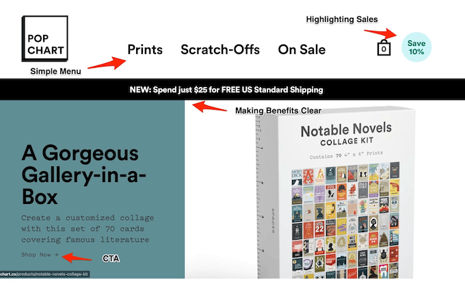
Like Harper Wilde, Pop Chart is created using a customized Shopify template. You can see that both sites are still different and have their own distinct branding, even if they both use themes.
Pop Chart focuses more on making sure the design highlights sales features like discounts or promos. This is a great trick you can use when you are designing your own ecommerce website – putting discounts on buttons or on banners to catch your user’s eyes and give them the incentive to buy straight away.
Pop Chart also makes great use of design to build a brand and highlight deals while still making it easy for users to navigate and keeping the important things clean, like menus.
3. Haus
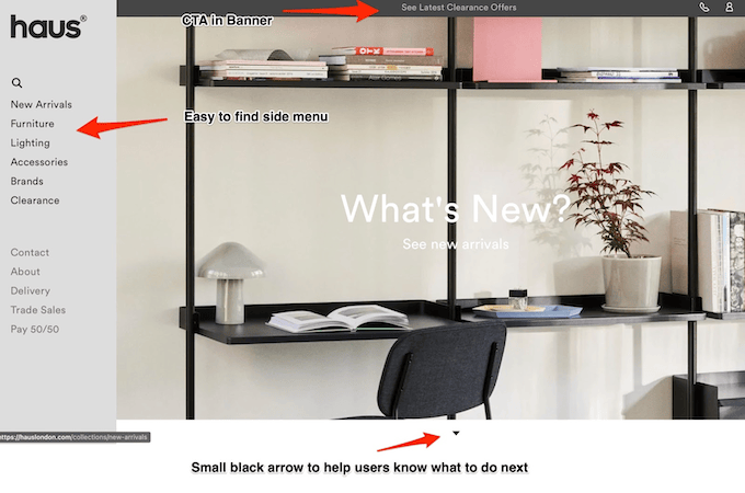
Haus is a great example of playing around with the design to keep things interesting while still being easy to navigate and keeping things simple.
You can see that Haus puts the Menu to the side, which means they can still use a big picture to fit their clean aesthetic and show off their products right away, without confusing users. They also use small details like arrows to help move users through the site and avoid people getting lost and clicking away.
Haus is a good example of using design in a creative and intentional way to get users to follow the website journey from your sitemap without sacrificing branding. You can see how easy it is to play with where and how you place different elements on your site to make it easier for audiences to navigate and create a better overall experience.
How to Get Started With Ecommerce Web Design
If you want to create a great ecommerce website design that’s personalized and functional, you can get started easily in just a few steps. Let’s break down the easiest and most effective way you can set up and design a site:
Step 1. Sign up for an Ecommerce Platform
As previously mentioned, the best way to design an ecommerce website is to sign up for an ecommerce platform, like Shopify, and choose a theme to customize.
Shopify is an easy and popular option, but there are plenty of other choices you might want to check out. We’ve recently reviewed the best options available, so if you want to see the pros and cons of each, check out our guide here.
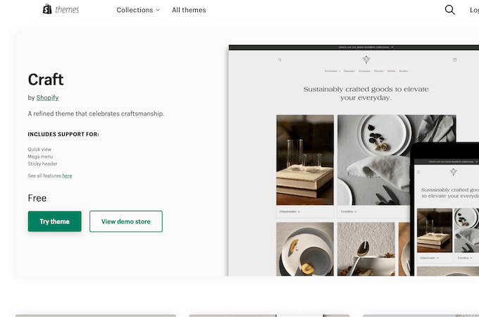
Step 2. Choose A Template Or A Free Theme
Most ecommerce platforms have tons of themes to choose from – many with selections ranging into the hundreds.
Once you’ve selected an ecommerce platform and got signed up, you can choose a theme that has all the functionalities you want. If you want to make this step as easy as possible for yourself, focus on choosing a theme that is the most similar to the final site you’d like.
You can customize colors, and add logos and fonts after, but the more similar to your end site your theme is, the less work you’ll have with planning your site.
Step 3. Create a SiteMap
As we mentioned before, to create a great site that makes sense, you should start by creating a site map on paper where you plan out which pages and category pages you have, and where each one will be linked.
Once you have a clear idea on paper of which pages you’ll need and how they all fit together, you can add any new pages or categories to your theme and start building out your website directly on your chosen platform.
Having the sitemap will also make it a lot faster for you to add things like buttons, menus, and footers to help with navigation.
Step 4. Download Plugins
The next thing you’ll want to do is add some customizable plugins to your site.
Each different platform will be able to integrate with different plugins, and big platforms like Shopify can integrate with thousands of other apps and services.
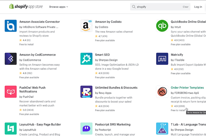
You should add plugins for any functionalities that aren’t included in your theme – so things like pop-ups, chat boxes, countdown timers, etc. Only add plugins that are really necessary though, because the more plugins you have, the slower your site.
Keep the focus on adding plugins that help with any of the following:
- Security
- UX Experience
- Customer Service
- Making Sales
- Building Trust
Step 5. Customize Your Theme
The next step is to actually customize your site with things like different fonts, images, and brand colors.
You’ll also want to add high-quality images for all of your products and pair them with short but powerful descriptions. This is where you get to play around with your plugins and theme builder to balance functionality with branding and aesthetics.
Try to always keep the user experience at the front of your design though. You can see from the examples we looked at that it’s better to keep things simple and use block colors and images to do the talking than to confuse your audience with too many CTA’s and buttons.
Things To Avoid With Ecommerce Web Design
When it comes to designing an ecommerce website, there are a few things you want to avoid. Here are some of the biggest mistakes most people make that you should try not to do:
Trying to Do Everything for Free
Yes, using an ecommerce platform is very cost-effective, and some even have free versions – but trying to design an ecommerce website that is safe enough to handle money and easy to navigate will be a pain.
If you try to do your own coding, you’ll just end up having more and more issues as your store grows – which will mean you could end up having to spend more money fixing code in the future. It’s worth the investment to work with a secure ecommerce platform that can guarantee online security and good loading speeds.
Making Your Site Too Complicated
When you are designing a site, it’s easy to get caught up in the fun parts of things, like the photos or color scheme. But, you need to remember the goal of an ecommerce site isn’t to look good – it’s to make sales.
Don’t fall into the trap of making the design so complicated that users get distracted, get overwhelmed when they get to check out or struggle to find the product they want. Take inspiration from the examples we looked at and make sure that the way to the checkout page is always clear and easy to find.
Using Low-Quality Images
All sites should strive to have high-quality images in order to improve the UX and SEO. But, when you are designing an ecommerce website, it’s even more important to make sure photos are high quality, that they load correctly, and that they are placed in the right places.
Some customers will base their entire purchase on a photo alone. Make sure that photos are optimized for loading speed and that you test each page before going live.
Final Thoughts About Ecommerce Website Design
Designing an ecommerce website can be both easy, and fun. As long as you are able to strike a balance between functionality and consistent branding, you can create a beautiful site you’re proud of that also converts into sales.
Remember that making sales and getting conversions should come before complicated design. Don’t feel pressure to have a sleek, animated website – using one of the free themes with your own twist will do just fine for what you need.
If you do want some pointers on making sales with your ecommerce store or getting it set up, here are some more Quick Sprout articles you should check out next:
- How to Start an Online Store in 6 Simple Steps
- Compare The Best Ecommerce Website Builders
- 9 Popular Ecommerce Products to Sell Online in 2021
from Quick Sprout https://ift.tt/z7YKsnw
via IFTTT
No comments:
Post a Comment