Wednesday, April 18, 2018

How to Increase Your Ecommerce Revenue by Leveraging Social Commerce

The ecommerce industry has become a very competitive space over the last several years.

In fact, more than half of Internet users across the globe made a purchase online in the last year. Younger generations with a strong purchasing power lead the way in this trend.

In fact, 67% of Millennials would rather shop online as opposed to going to a physical store. This is great news for your ecommerce brand.

Yes, obviously you’ve got lots of competition when it comes to selling products online. But if you have the right tools and marketing strategy, you can do a lot of things to gain an edge over your competitors.

You should know how to design a homepage that converts. It’s also important for you to know which elements add credibility to your website.

While all of this is necessary, it’s not enough. In addition to your website, you need to be taking advantage of as many platforms as possible to effectively sell your products.

That’s because you can’t always rely on consumers navigating to your website. You need to make sure your products are readily available for purchase in places where your customers spend lots of time.

Enter social media networks.

Just like ecommerce, social media continues to be a growing trend. There are nearly 2.5 billion social media users across the globe.
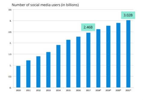
image4 4

Experts predict that this number will reach 3 billion by 2021.

Your ecommerce brand may already have an active presence on social media. It’s a crucial marketing strategy, but you can take this approach one step further.

Use social media to sell your products.

If you’ve never done this before, you may not know where to start. Fortunately, you’ve come to the right place. I’ll tell you everything you need to know about how social commerce can boost the revenue stream of your ecommerce shop.

What is social commerce?

Let’s start with the basics.

Social commerce is a relatively new concept. The term was first used in 2005. But since then, its meaning and application have evolved.

With social commerce, you can sell your products through a third-party platform. More specifically, the platform you’re selling through is a social media network.

For example, if a Facebook user sees something they want to buy, they can do that directly through Facebook’s interface as opposed to having to navigate to the seller’s website.

This is great news for your ecommerce store. If you’re relying on consumers to visit your website after seeing an ad that promotes your products, it’s hurting your conversion rates.

Why?

It’s too many steps. Sure, you’ll still see some conversions. But simplifying the steps in the purchasing process will boost your conversion rates.

Take a look at the impact social media has on buying decisions:
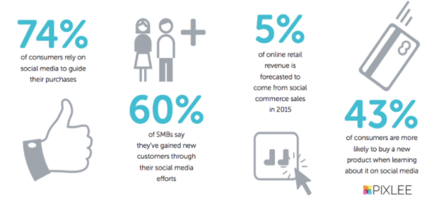
image1 4

The majority of consumers say they rely on social media to guide their purchasing decisions. When a consumer sees a product on social media, the chances of them buying it go up.

An additional 31% of people say they use social media to browse for products they are interested in buying.

For ecommerce businesses, it’s a no-brainer to implement a social commerce strategy.

Make your products available on Facebook

If you’re new to social commerce, Facebook is the most logical place to start. Eventually, you’ll add this feature to your other social media pages as well, but this is the best place for you to get your feet wet.

As I said earlier, social commerce is still new. Not every consumer has jumped on board with it yet.

But the majority people who have made purchases through social media platforms are doing so via Facebook:
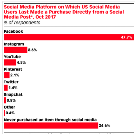
image2 3

As you can see, roughly 35% of social media users say they have never bought something through social media. But nearly 50% of social media users say they have used Facebook to make a purchase.

This makes sense. Facebook has always been a trendsetter in the social media world.

Their platform is extremely friendly for both everyday users as well as brands.

Facebook business pages have the ability to leverage this platform in several ways to drive sales.

First, they can list products directly on their page.

This feature mimics the appearance of a standard ecommerce shop we’ve all grown accustomed to.

Second, Facebook also implemented a “Shop Now” button that brings users directly to the brand’s website.

Check out this example from the DressLily Facebook page so you can see what I’m referring to:
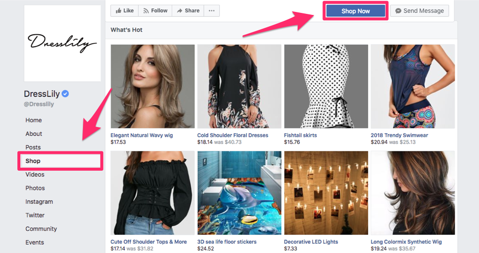
image8 1

On their Facebook page, you can see the “Shop” button on the left menu. This brings their customers to the screen you’re looking at now.

But if customers click the “Shop Now” button on the top of the screen, they will get brought to the brand’s website.

It’s important you take advantage of both of these buttons. As we previously saw, not all consumers have adapted to the social commerce trends. You don’t want to turn their business away. Some people may not be comfortable yet buying directly through Facebook, so giving them the option to visit your website is necessary.

To set up purchases directly through Facebook, you’ll need to associate a Stripe or PayPal account with your page.

Each of these charges 2.9% of the purchase plus an additional $0.30 per transaction.

I realize that these fees may be higher than the credit card fees on your website, but it’s just something you’ll have to accept.

Even though the payments get processed through third-party companies, you won’t need to use those platforms for collections. All your orders can be managed directly from your Facebook shop.

You’ll have real-time information and access to your current, pending, and past orders purchased through Facebook.

Sell on Instagram

Facebook purchased Instagram in 2012. It’s no surprise Instagram has seen so much success over the past several years.

On an average day, 95 million pictures and videos are published on Instagram. The implementation of their “Shop Now” feature is turning them into a social commerce powerhouse.

Here’s an example of how West Elm implemented this feature with a sponsored Instagram advertisement:
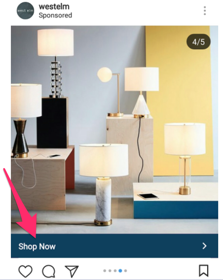
image6 4

Imagine a user scrolling through their timeline. They’ll see not only the posts from profiles they’re following but some ads as well.

Just like a regular Instagram post, these ads can contain several photos and videos. It’s called a carousel ad. If the first image captures the user’s attention, they may scroll through the others to see what else this brand is selling.

Either way, the “Shop Now” button remains part of the post the entire time. It’s an effective way to increase conversions.

As we discussed earlier, the more steps involved in the purchasing process, the worse your results will be.

If your current Instagram strategy is having a post on your profile with a caption that says “link in bio” to entice purchases, it’s probably not a huge success. There’s too much friction.

But the “Shop Now” button simplifies the process and makes it easier for users to buy products in just a couple of clicks.

In addition to carousel ads, you can advertise using a single photo, single video, and slideshows. The slideshow creates a video by automatically looping up to 10 photos.

You can also change the CTA button of your ad to “Learn More.” Here’s an example from Rumble Boxing:
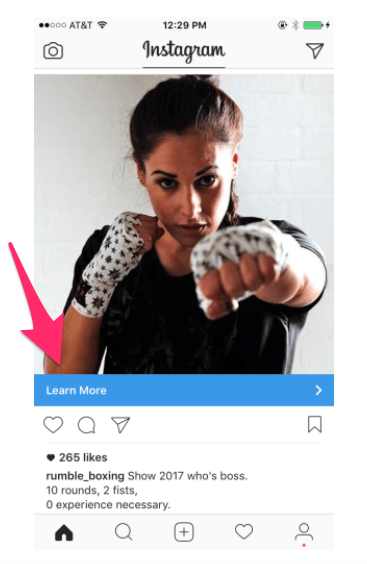
image5 4

This button takes users to a landing page where they can get more information about classes and schedules. From here, they’re able to make purchases as well.

Selling through Instagram ads is great because you’re able to decide which users will see your posts.

You can customize your advertisement based on your goals, such as:

  • brand awareness
  • reach
  • local awareness
  • traffic
  • engagement
  • lead generation
  • conversions
  • product catalog sales
  • store visits

All these options are available when you build your business on Instagram.

Add buyable pins

As an ecommerce shop, you need to have an active presence on Pinterest as well. If you’re not familiar with Pinterest, I’ll briefly explain how it works.

Many users like to browse through the platform for inspiration, ideas, and products they’re interested in.

For example, someone may use Pinterest for ideas on how to decorate a room in their home. When they like something, they can save the post or “pin” it to one of their boards.

Pinterest is great for businesses because it has a feature allowing the businesses to set up buyable pins for ecommerce shops. Here’s an example of what it looks like:
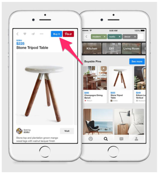
image7 3

When a user sees this table when they’re browsing on the platform, they can make a purchase with just a few clicks.

Your customers can pay with their credit cards or Apple Pay. This is great news for shoppers browsing on their mobile devices.

With this feature, buyers can complete the purchase process with just one click, which will increase your conversion rates dramatically.

Recent studies show that 73% of Millennials would like to have the ability to make all their payments from mobile devices.

Apple Pay helped Cocoweb increase conversions on their mobile platform by over 20%. Zin Home also saw a 20% increase in sales after implementing Apple Pay.

It’s important for you to establish your social commerce strategy on mobile applications that process transactions. In addition to Facebook and Instagram, Pinterest needs to be your priority as well.

Leverage social influencers

No social commerce campaign would be complete without the help of social influencers.

Micro influencers increase your product credibility and boost sales revenue. Once you form relationships with these influencers, you’ll have them post content to their personal profiles.

It’s a viable marketing strategy. That’s why the majority of businesses are increasing spending on influencer marketing over the next year:
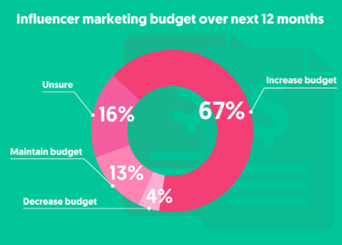
image3 4

This strategy is continuing on an upward trend. In the last 12 months, there has been a 325% increase in searches for “influencer marketing” on Google. If you haven’t been researching the topic, it looks like your competitors have.

Another reason why influencer marketing works is because it’s profitable.

Research shows that influencer marketing has a return on investment rate that’s 11 times higher than that of other content marketing campaigns.

Working with social influencers to promote your products will go hand in hand with your social commerce strategy.

Conclusion

It’s tough for ecommerce shops to stay relevant in such a competitive space.

But you should look at these trends as an opportunity as opposed to a struggle. To gain an edge over your competitors and increase sales revenue, make your products available for purchase on as many platforms as possible.

Take advantage of social commerce shops in addition to your traditional ecommerce website.

Start with Facebook. The majority of consumers who have bought products on social commerce platforms have used Facebook to do so.

But you should also leverage other social networks as well, such as Instagram and Pinterest.

Use social influencers in conjunction with your social commerce strategy to maximize your brand exposure.

How is your ecommerce company using social commerce platforms to drive sales?


from Quick Sprout https://ift.tt/2JVxlYZ
via IFTTT

Monday, April 16, 2018

How to Generate Leads with Facebook Ads

Social media marketing has become one of the most effective ways for businesses to have success in the digital era.

In fact, 95% of adults between the ages of 18 and 34 follow brands on social media. Facebook leads the way in this category. According to Statista, Facebook has 2.2 billion active monthly users.

You can see why it’s so appealing for brands to have a presence on this platform. I hope  your company is on Facebook to.

To have success marketing on Facebook, you need to be active on a daily basis. Post content to your profile. Share photos, videos, and run promotions.

Facebook allows you to broadcast live videos to your followers. You should be taking advantage of that as well.

In fact, live videos are such an effective marketing strategy that it made my list of the top marketing trends to look for in 2018. Lots of these promotional tactics can be done  free.

But if you really want to take your social media marketing strategy to the next level, you need to run advertisements on Facebook.

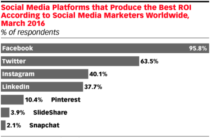
Why Facebook? Well, in addition to  having the highest number of active monthly users compared to other social platforms, Facebook ads deliver a high ROI:

image2 4

Obviously, running these ads isn’t free. But knowing that such a high number of marketers say  this platform delivers the highest ROI compared to other social media networks should make it worth your while.

That said, nothing is guaranteed. Not all advertisements on Facebook are successful. That’s why I created this guide.

If you are new to Facebook ads or need some improvement running your existing ones, this guide is for you. I’ll show you how to set them up and generate leads for your business.

Set your goals

First things first. Why are you running this ad? You need to determine your goal ahead of time.

There are a few reasons for this. First, you want to make sure  the ad you’re creating is aligned with your goals. It’s also much easier to measure the success of a campaign if you have a goal in mind.

But another reason why you’ll need to set up a goal first is because Facebook will ask you what you’re trying to accomplish when you’re putting the ad together.

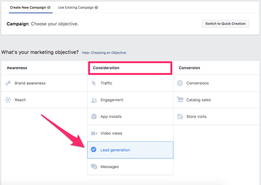
Here’s a look at different marketing objectives for you to choose from:

image3 5

As you can see, there is as an option for lead generation under the consideration column.

This will help you collect information from Facebook users interested in your business.

The cool thing about the lead generation campaign is you can set up a split test when you’re running it. I’m a big advocate of using A/B testing to maximize efficiency.

You can run tests of your campaign based on elements such as placement, audience, and delivery optimization. This makes it easier for you to measure your results and make any necessary adjustments. But we’ll discuss this concept in greater detail later.

You can also select one of the choices from the awareness column as an alternative method of generating leads.

Selecting the brand awareness option will aim to get your ad exposed to people who are most likely to pay attention to your message. A reach campaign, on the other hand, will expose your ad to the highest number of people possible.

Identify your target market

Next, you’ll have to determine who will see your ad.

No matter what type of business you have or what industry you’re in, it’s important you know your target market. In fact, knowing how to identify the target market of your startup is one of the first steps of creating a business.

Those of you who have been in operation for a while should have done this years ago.

That said, it doesn’t mean this selection will be cut and dry. You may have a diverse target market. Is this ad for everyone?

For example, let’s say your company sells a wide range of products and services. There’s a good chance you sell items intended for men and women of all ages.

Based on the goal  you’ve previously defined, your ad may be geared toward a specific segment or a larger target market.

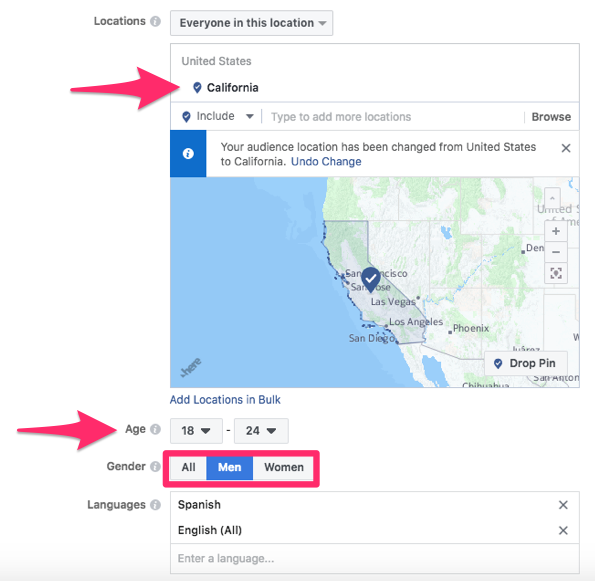
Here’s an example of how you could set this up based on your audience:

image5 5

As you can see, this ad is targeting men located in California. They are between the ages of 18 to 24 and speak English and Spanish.

Facebook allows you to get specific here. This is great because you can create multiple ads based on different segments of your target market.

Generic ads intended to reach a massive audience won’t be as successful. But if you target a specific group of people with your ads, you’ll be able to generate more leads.

All the information used is based on what each user puts in their Facebook profile. Keep in mind, this won’t be 100% accurate.

You’ll get some people who lie on their profiles about their age, gender, location, etc. But this shouldn’t be drastic enough to skew your results.

Set your budget

After you select your target market, you’ll have to determine how much money you want to spend on the ad.

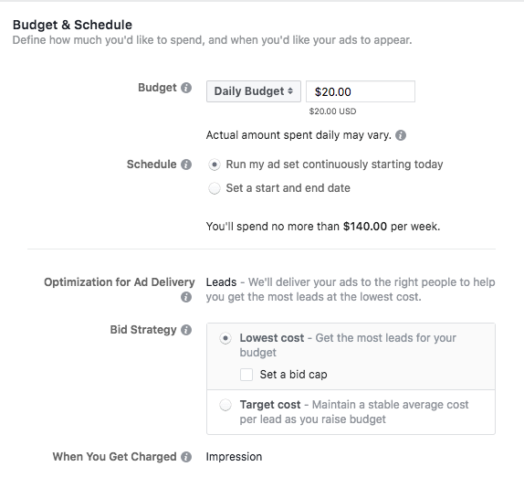
Facebook makes it easy for you to set this up. Here’s what your options will look like:

image4 5

This example uses a daily amount. But you can also use the total amount you’d like to spend on the lifetime of the ad.

Even though I set the daily budget to $20, it won’t always be exact. That’s because Facebook automatically shares your ad based on the most opportunities.

Certain days, the ad spend may be higher, but other days, it would be less to keep the daily average at $20. You’ll get charged based on each impression.

You can also set start and end dates for your ad. Or you can let it run continuously and stop it manually when it’s time.

Choose the format for your ad

Not all ads are the same. Facebook lets you choose which type of advertisement you want to run. Here are your options:

  • video
  • image
  • collection
  • carousel
  • slideshow
  • canvas

Video and image are both pretty self-explanatory, but I’ll explain what the others mean.

A collection is when display different items from your product catalog. It encourages users to shop by looking through a few items. Based on what you’re selling and the target market, these items will be customized for each person.

This is a great strategy for sales and conversions—but not necessarily lead generation. You can still use it as a marketing strategy.

Carousels allow you to display up to ten different videos or images within one advertisement. Each one would have its own link.

Slideshows use images, text, and sound to showcase your ad. Canvas ads can be opened as a full-screen display, and they are fully optimized for mobile devices.

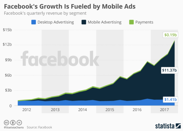
Mobile ads are Facebook’s highest source of revenue.

image7 4

That’s because businesses recognize how many Facebook users access the platform from their mobile devices.

In fact, as of January 2018, more than 95% of users access this social media network from smartphones.

But let’s get back to selecting your format. Each format has certain rules and restrictions. I’ve highlighted some of the top specifications for each one you need to keep in mind when designing your ads.

Video

Max length: 240 minutes

Ratio: 9:16 to 16:9

Text: 125 characters

Headline: 25 characters

Description: 30 characters

Sound and captions are both optional for your ads; however, it’s highly recommended that you include these features. Also, if your video thumbnail has more than 20% text, it may not have high delivery rates.

Image

File: png or jpg

Ratio: 9:16 to 16:9

Text: 125 characters

Resolution recommendation: minimum 1,200 x 628 pixels

Just like with videos, if your images contain more than 20% text, it can negatively impact the delivery rate. Make sure to limit the text on your picture ads.

Collection

Minimum image width: 600 pixels

Minimum image height: 600 pixels

Aspect ratio tolerance: 3%

Headline: 25 characters

Text: 90 characters

Carousel

Minimum cards number: 2

Maximum cards number: 10

Maximum video size: 4GB

Resolution recommendation: minimum 1080 x 1080 pixels

Link description: 20 characters

Canvas

Text: 125 characters

Minimum video length: 1 second

Maximum video length: 240 minutes

Bitrate limits: No limit for files under 1GB with 2-pass encoding

If you’ve got a vertical video ad with an aspect ratio taller than 2:3, it needs to be masked to 2:3. It’s recommended that you upload the highest possible video resolution based on the file and ratio limits.

Determine the placement and measure your results

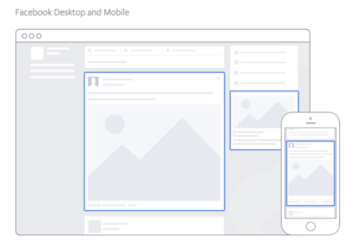
Next, you’ll decide where you want your ads to be placed. Here’s a visual representation to show you what I’m referring to:

image1 5

You can place your ad on a mobile newsfeed, desktop newsfeed, or right column advertising bar.

Mix this strategy up. This relates back to A/B testing you’d need to run to see which version delivers the best results.

Keep track of everything. See which ads are working and which ones aren’t generating enough leads.

It’s important that you constantly rotate your ads. You don’t want your audience to keep seeing the same ads over and over again.

You should also try to market to different audiences. Just make sure everything always looks professional. Focus on your call to action. Change that as well to see how that changes the results.

Advertise on Instagram

In case you didn’t know, Facebook owns Instagram.

It’s really easy for you to run Instagram ads from the same place where you’re setting up your Facebook campaigns.

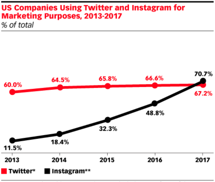
Instagram has become such a popular marketing medium that 70% of hashtags on this platform are branded. Furthermore, 71% of businesses in the United States are using Instagram to promote their companies:

image6 5

They’ve surpassed Twitter in this department.

If you want to stay competitive, you should be running paid ads on Instagram in addition to running them on Facebook. It’s easy to do since you’re setting them up through the same platform. You’ll just need to make a few extra clicks.

Conclusion

Having an active social media presence is an effective way to promote your brand at little to no cost. But if you want to take your social media marketing strategy to the next level, you should consider running Facebook ads.

These ads are perfect because Facebook offers tools specific for lead generation.

They are easy to set up as well. Just follow this guide as a reference to steer you in the right direction.

Start with your goals. Identify your target market. Set a budget.

After that, you’ll have to figure out which type of ad you want to run and where you want to place it. Keep all the ad specifications in mind when you’re going through this process.

Measure your results. Rotate your ads and make adjustments based on how successful they are.

You should also consider running ads on Instagram. Since those ads will be controlled from the same platform as your Facebook ads, it will be just as easy for you to set up.

If you follow these tips, you can turn your Facebook marketing strategy into a lead generation machine.

What types of Facebook ads are you running to generate more leads for your brand?


from Quick Sprout https://ift.tt/2veIWPE
via IFTTT
Friday, April 13, 2018

Stop Losing Sales with These 8 Persuasive Web Design Principles

How do you convince a person to do something?

When you’re having a face-to-face conversation with someone, you know how to persuade them. But you don’t have the same luxury of conversation when you’re dealing with visitors to your website.

Fortunately, you can utilize online persuasive tactics to close sales and improve your conversion rates.

Many of these factors have to do with the design of your website. The way your current website is designed could be the reason why you’re losing sales.

Some of your design choices may actually be putting off visitors and hurting your conversions. Obviously, you’re not doing it intentionally. But either way, you’ll need to address these mistakes and make the necessary changes.

Since you can’t actually talk to people who are visiting your website, you need to show them why they should do something.

That’s why I created this guide. I want to show you the top persuasive web design principles that will lead to conversions.

1. Emphasize clarity

What’s the purpose of your website?

It should be clear and obvious to anyone visiting your website from the moment they land there. They should be able to tell what you do and what you’re offering, even if they’ve never heard of your company.

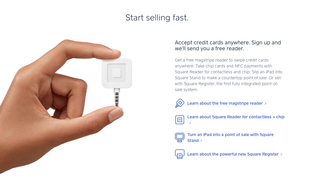
Here’s a great example of clarity from the Square website:

image4 7

You can figure out exactly what this company does. They use phrases such as “start selling fast” and “accept credit cards anywhere” to help visitors understand what they’re offering.

Even better, they’ve got a clear picture of their product. The hand that’s holding the device is used to show how small it is, which is a huge selling point.

Pictures are a great way to clarify your message on your website. We’ll talk about how to use visuals in greater detail shortly.

Analyze your website. Obviously, you know what your company offers, but is it clear to others?

Put yourself in the shoes of somebody who has no prior knowledge of your brand, services, or products. If they can’t identify what you’re offering on your website, you need to improve the clarity of your message.

Don’t use any ambiguous terms. Get right to the point.

I know I’ve been saying how important this is for new visitors, but it’s just as important for your existing customers.

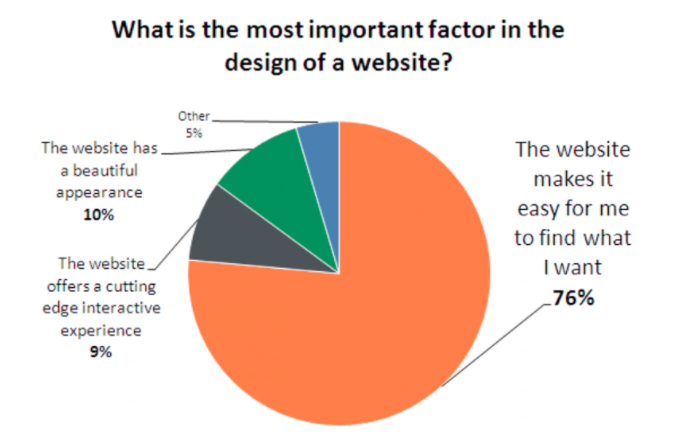
It should be very easy for people to find what they want on your website:

image9 1

As you can see from the data, 76% of those surveyed feel that being able to find what they’re looking for is the most important factor in the design of a website.

Take some time to remove anything from your website that doesn’t add to the clarity of your message. Now it will be much easier for you to persuade visitors to buy something.

2. Use visuals

It’s easier for people to understand an image than to read text. Obviously, you’ll need to have some words on the screen, but you can let pictures do the talking for you.

Recall the earlier example of Square. The words on the screen told visitors if they buy the gadget, they can accept credit payments anywhere and get paid fast, but how can they do it?

Well, the picture was very clear. There’s a small device that can be held with your fingertips and that plugs into mobile devices.

Explaining your product isn’t the same as showing it.

Here’s something else to take into consideration. First impressions matter. You’ve probably heard it your entire life. But have you applied it to your website?

What’s the first impression people get when they land on your homepage?

A clear picture can help focus their attention and ultimately make the page more visually appealing. Too much text without any photos will crush your sales.

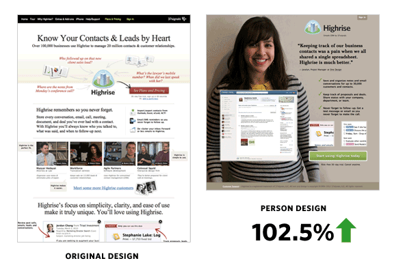
Take a look at this case study from Highrise:

image3 7

Highrise offers CRM software. Their original website had some images, but there was no clear point of focus. It was cluttered, and a visitor could easily get lost on the page, eventually leaving without converting.

Highrise redesigned their website and included a picture of a person.

What does this person have to do with their software? Nothing. But they still saw their conversion rates increase by more than 100%. Largely, it’s because the new design was much cleaner.

Using a picture that takes up most of the page forces you to choose your words carefully, which means the words on the screen are much more impactful.

Make sure your page has a simple, clear layout, featuring at least one image as the focal point.

3. Prioritize the most important elements

As I just said, you need to have images on your website. But what if you have multiple images? Your website needs to have a visual hierarchy.

Visuals get attention, so you’ll need to make it clear which images are more important. Here are some of the best ways to do this.

First, the size of an image should clearly communicate how important it is. Simply put, the bigger the image, the greater its importance. If you have an ecommerce website, your top selling items should be the biggest on the screen.

You could also draw attention to elements on your website based on their position. Let’s say you’re running a new promotion you want everyone who visits your site to see.

Don’t bury it in small letters on the sidebar or in tiny print at the footer of the page. Make it big, bold, and clear in the middle of your page.

Something that’s written in huge letters across the top of the screen is obviously more important than a small icon in the corner.

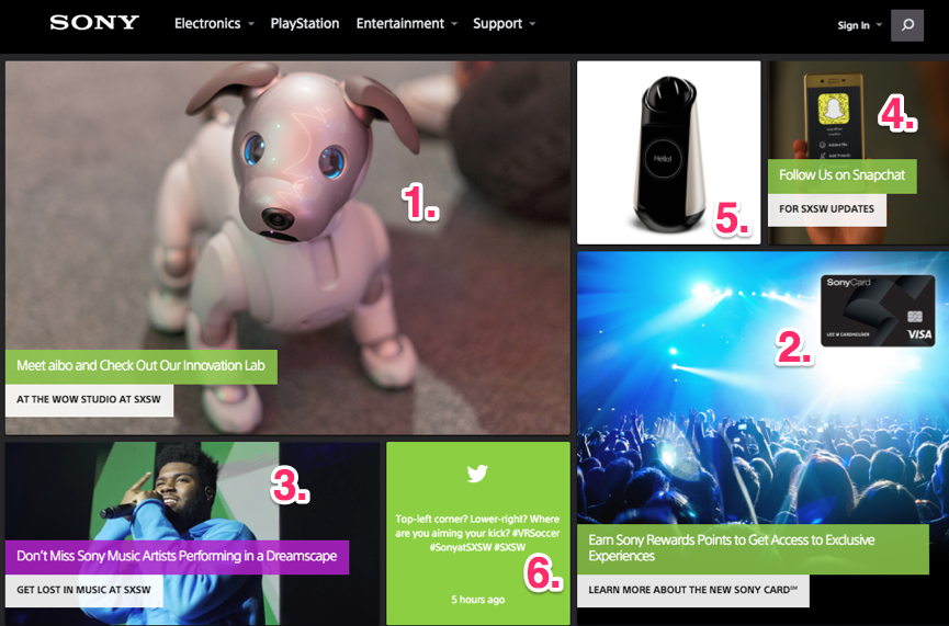
Let’s review the Sony website:

image5 7

There’s a lot going on here. Clearly, this design utilizes lots of visuals.

But it’s clear which elements are the most important, according to the visual hierarchy principle. As you can see, I’ve ranked them first through sixth.

That’s how your eyes will move from one element to another, based on the size, placement, and color of these images.

Look at your website, and decide what the most important element is. If it’s not the biggest and clearest element on the page, you’re not effectively using this persuasion tactic.

4. Use common language

As I said earlier, you’ll need to use a combination of both images and text to create a persuasive website.

The way you use this text will have an impact on sales and conversions. You need to make sure everyone reading your website understands what you’re saying.

Use short words and phrases to get your message across. Bullet points are great too because while they highlight your most important sales points, they also make it easy for people to scan the information.

You want to avoid large blocks of text. Nobody will read that.

Don’t use industry slang or terms people can’t understand. For some of you, this will be easy. But for those of you who are in industries like manufacturing or technology, it could be a challenge.

I’ve got a trick to help you determine whether or not you’re using common terminology. Do you have a son, daughter, niece, nephew, cousin, or younger sibling who is in elementary school?

Have them read your website. If there are words on the screen that a 5th-grader can’t understand, get rid of them. Don’t try to sound like a doctor or a lawyer, even if you are one.

If people can’t understand you, they won’t buy what you’re selling.

5. Use colors to improve conversions

Different color schemes can impact sales on your site.

It comes down to psychology. Our minds have certain associations with colors based on how they are used in our daily lives.

For example, green is associated with go, and red is associated with stop. It makes sense to test a green CTA button.

Here’s another example. What color is Valentine’s Day? Obviously, days can’t be a color. But I know that didn’t stop you from thinking about red and pink.

Know your customers. Are they male or female? What part of the world are they from?

These questions will help you come up with a color scheme that drives sales.

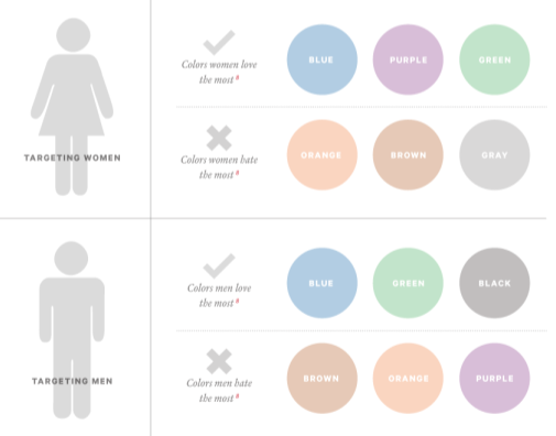
Here are some colors that men and women like and dislike the most:

image2 7

Figure out what emotions you want your customers to have when they’re visiting your website.

Once you come up with the answer, you can appropriately change your color schemes to influence people’s actions.

6. Limit choices

How many products is your company selling?

Some of you might have an extremely limited product line of just a few times. But those of you selling hundreds or potentially even thousands of items on your website need to pay close attention to this section.

Yes, I’m sure all your products are great. But that doesn’t mean you should try to cram 100 products onto your home screen.

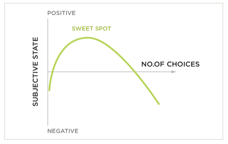
Be selective. Understand the paradox of choice. It’s a simple concept. The more choices someone has, the lower the chances of them making any choice at all:

image1 7

My recommendation would be to focus on your products that sell the most and have the highest conversion rates and the largest profit margins.

Put these on your website as the focal point. Let your other items be found through a search feature or something like that.

You could potentially even eliminate some items from your product line to make choosing easier.

If people have too many choices, they are also more likely to have buyer’s remorse. They’ll constantly think about an option they could have bought instead, which gives them a bad feeling.

As a result, they could have a negative association with your company as a whole.

The best way for you to be persuasive is by offering fewer choices.

7. Use only one CTA on each screen

This piggybacks on my last point.

I see too many websites try to add multiple call-to-action buttons all over each screen in an effort to get multiple conversions. But instead, they’re missing out on sales.

Too many CTAs will confuse the visitor. Giving them too many choices won’t lead to conversions.

I understand you may be trying to accomplish many different goals on your website. But don’t overwhelm your visitors.

When you want to drive sales, your CTA should mirror your goals.

Have all the other elements on your page leading toward one CTA.

8. Implement patterns

People get used to patterns.

When you implement patterns on your website, the visitor will know what to expect as they continue.

One of the best examples of this in terms of persuasive web design is the scrolling feature. As the visitor scrolls down the page, they see more information.

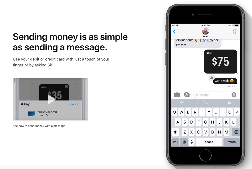
Here’s what this pattern looks like on the Apple’s website:

image8 4

This is one of the first screens you see when you start scrolling on their website to learn more about Apple Pay.

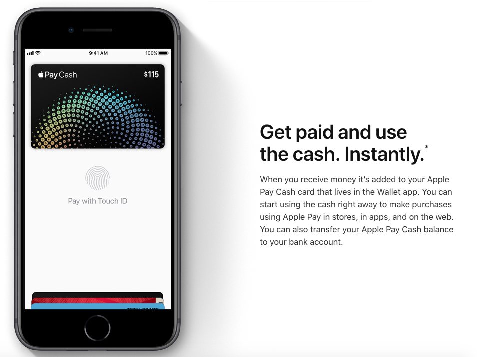
There is a heading with some text on the left side of the screen and an image on the right side of the screen. As you continue to scroll, this is the next image you see:

image7 6

It’s similar, but not exactly the same.

Instead, the image has flipped to the left side of the screen, while the heading and text have moved to the right.

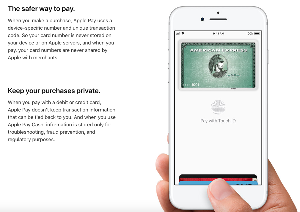
If the pattern is to continue, what do you expect to see on the page as you scroll down even further?

image6 7

Exactly. The image is back on the right and the text is on the left.

It’s a very simple pattern, but it’s effective. People have a greater chance of retaining this information if it’s presented this way.

Imagine if they tried to cram all three pictures and all of the text onto one screen. It would be a cluttered mess.

The pattern they used creates a clean design and simple navigation. Visitors don’t have to click on anything or navigate to a new landing page. All they need to do is continue scrolling.

This persuasive tactic helps focus the attention of your website visitors. Websites with simple designs have higher conversion rates.

If a company as successful as Apple is using this strategy, I think it’s safe to say you can follow their lead.

Conclusion

You might be a persuasive speaker, but that won’t help you create sales on your website.

Instead, you need to implement persuasive design principles to convince visitors to buy whatever you’re selling.

It starts with clarity. Make it extremely obvious to everyone what you’re offering.

Add visuals, and prioritize the most important elements on your page according to the visual hierarchy rules.

You’ll need to use text as well. But make sure you’re speaking in terms everyone can understand.

Create a color scheme that speaks to your audience. Limit choices, and create patterns.

Stick to one CTA per page.

Follow these persuasive web design tips if you want to improve your sales.

What persuasive design elements have you implemented on your website?


from Quick Sprout https://ift.tt/2IQAMyP
via IFTTT
Wednesday, April 11, 2018

How to Guide People’s Emotions to Drive Sales

Successful marketers know how to go the extra mile when promoting their brands, products, and services.

You need to understand what role psychology plays in the buying process. For example, different color schemes can impact sales on your website.

Those of you who want to take your marketing strategy to the next level need to understand the way your customers think. Use this information to your advantage.

People behave a certain way when specific emotions are triggered. I’m sure you can see this in your life as well.

Have you ever punched a wall or broken something when you’re upset? You wouldn’t normally do that, but you might behave that way as a result of a strong emotional response.

Don’t worry, we won’t to try to get your customers angry or play a game of psychological warfare with them.

Instead, I’m going to show you how you can trigger a variety of emotions with different marketing campaigns. As a result, you’ll be able to drive more sales.

Here’s what you need to know about guiding the emotions of your customers.

Leverage the power of fear

Fear is one of the most powerful emotions, which is why I want to use it to start our discussion. You can use fear as a sale tactic in many different ways.

For starters, try to create the fear of missing out on something, better known as FOMO.

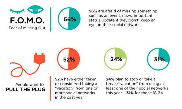
In today’s age of social media, people feel FOMO more than ever. Take a look at these statistics from a recent study:

image3 12

More than half of social media users believe they need to constantly monitor their social profiles because they’re afraid they’ll miss out on something.

It’s becoming such a problem that people recognize the fear is affecting their behaviors. That’s why so many social media users consider taking a break from these platforms.

How can you leverage this emotion from a marketing perspective? Create ads for your website, email campaigns, and social profiles that are time-sensitive.

For example, you could run a flash sale offering 40% off everything on your website for the next six hours. This type of marketing strategy will cause users to act fast for the fear that they’ll miss out on the sale.

They are already interested in your products and have some items in mind they want to purchase. Taking advantage of a flash sale is the perfect time for them to act.

Depending on what kind of products or services you’re offering, there are other ways to create fear in the minds of your customers.

For example, let’s say your company sells home security systems. You could create an advertisement that shows how your products help prevent a burglary or home invasion.

This can create fear in the minds of prospective customers. They may think to themselves that their current security system wouldn’t protect them in the event of an emergency.

Don’t get me wrong, we’re not trying to traumatize your customers here. There are more subtle ways to approach this.

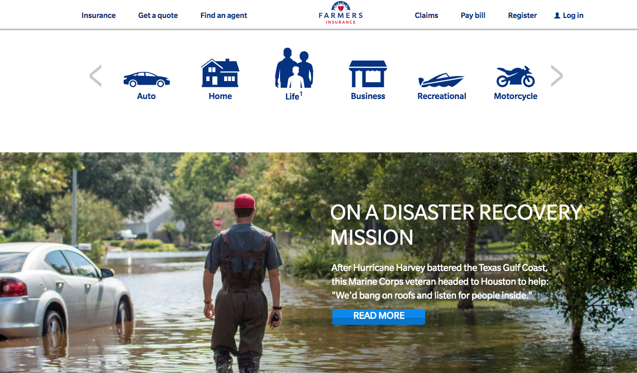
Check out this example of fear-based copy used on the Farmers Insurance website:

image8 8

Someone shopping for home insurance can see why it’s important to have flood coverage. In the event of a natural disaster, the right insurance is there to protect you.

Come up with ways to market your product the same way. It’s applicable in nearly any industry, even if your company just sells clothes.

It’s going to be a cold winter, so you need to buy a sweatshirt.

Although this type of fear isn’t as powerful as a threat of burglary or natural disaster, it’s still effective.

Take advantage of greed

People are greedy by nature. Don’t think so?

Think about the first day of spring. Ice cream parlors all over the country offer promotions like a free cone or scoop.

Customers line up around the block waiting for an hour to get something free that would normally cost them only a couple of dollars. Why? They’re greedy.

There’s nothing wrong with this. But as a marketer, you can use this concept to your advantage when coming up with new promotions.

Offer items at a discounted rate, and then try to upsell to your customers.

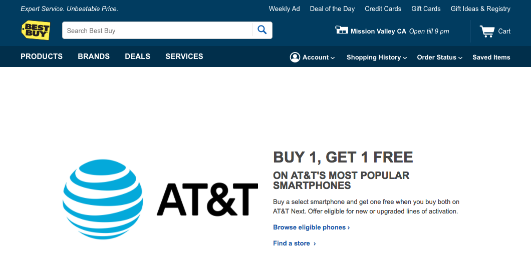
Here’s a great example from the Best Buy website:

image2 12

BOGO. Buy one, get one.

If someone is shopping for a new smartphone, how can they turn down this offer? If they buy one smartphone, they’ll get another one free.

But this is a great marketing plan because the money isn’t made on the actual devices. Wireless providers make all their profits from their plans.

It’s worth it to give away something that’s worth a few hundred dollars. Now, instead of adding one device to the contract, the customer will add two and pay for two plans.

Try to come up with a way to apply the same concept to your marketing strategy.

Build trust

Typically, words such as fear and greed don’t have a positive connotation. But not every emotion needs to be negative.

Establishing trust with your customers is another powerful way to encourage sales. A great way to create trust is by implementing a customer loyalty program.

Loyal customers will spend more money. But you need to make sure all your offers are transparent if you want to be perceived as trustworthy.

Don’t surprise your customers with any hidden costs or fees when they’re making a transaction.

Anytime someone buys something from you, they trust you with their personal information, such as their credit card numbers.

Recent studies show that credit card fraud has become a growing concern in the United States.

image1 12

If one of your customers hasn’t been affected by fraud personally, I’m sure they know at least a few people close to them who have.

Customers won’t trust you with sensitive information if you can’t convince them your company is trustworthy. You need to take the proper steps to protect your customers’ information and understand the elements that add credibility to your website.

Offering a secure checkout process, free returns, and easy access to customer service will get you started in the right direction.

Add customer testimonials to your website as well.

Once people trust your brand, it will be much easier for you to get higher sales.

Create a sense of belonging

Use your brand to establish a community among your customers. There is a reason why people are buying from your company. All these people have something in common.

It’s your job to figure out what those commonalities are to establish a community based on them.

As a result, you’ll be able to trigger emotions that drive sales.

Here’s what I mean. Let’s say your company sells boxing equipment. Because it’s a niche industry, all your customers obviously have something in common.

They know what it’s like to get punched in the face, and they like to stay in great physical shape. You could create a forum or devote a section of your website to some other user-generated content.

Your customers can share stories with each other about their workout routines and even talk about recent victories or defeats in the boxing ring.

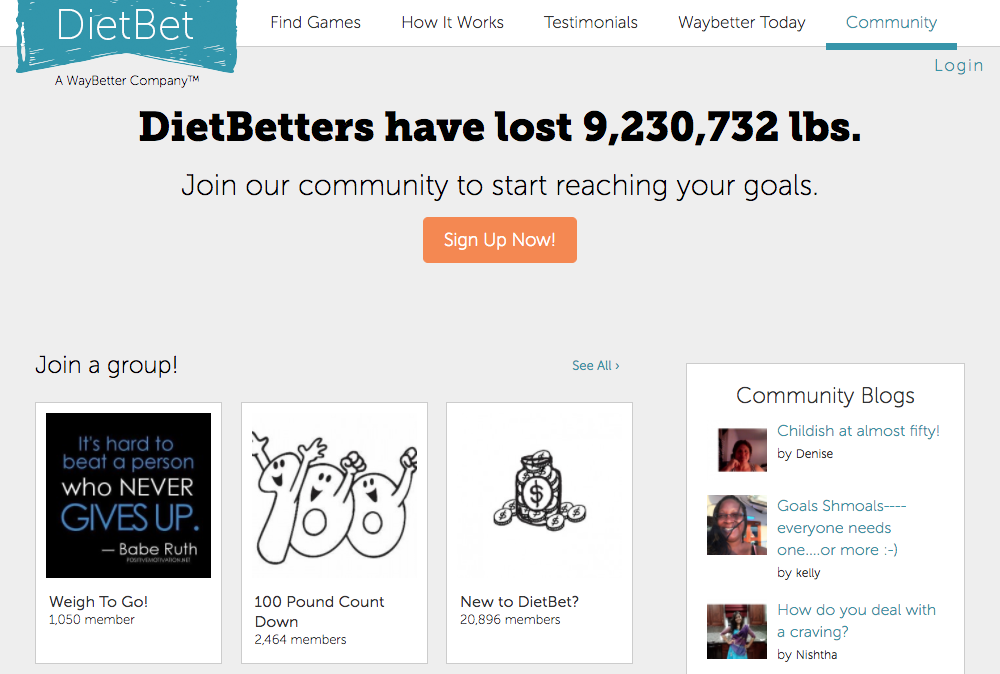
Here’s another example of this concept from Diet Bet:

image6 12

This website hosts a community of people who all share the common goal of losing weight.

Once you set up a place where your customers feel a sense of belonging, it will ultimately lead to more conversions and higher sales.

That’s because people will have a reason to visit your website more often. They may initially go online to write on a forum but might end up buying something as well.

Eliminate frustration

Frustration is not an emotion you want to have associated with your brand.

Let me quickly tell you a recent frustrating experience I had while trying to buy something online. I don’t want to call out the company, so I’ll leave their name out of this.

I saw something in a physical store location last week when I was walking around. I was interested but didn’t want to carry the product with me for the rest of the day, so I planned to order it online.

The sales associate took my name and email address and sent me the product information, which was supposed to make my life easier.

Well, a few days later I went to the email, clicked on the product, and attempted to check out online. I filled in all my billing and shipping information, and then I was told I needed to create an account to proceed.

Bummer. But I still created an account. Then the site prompted me to enter all my information again.

After entering my name, address, and billing info three different times on the website, I decided to pick up the phone and try to order that way. An automated system told me that all representatives were busy and then hung up the call.

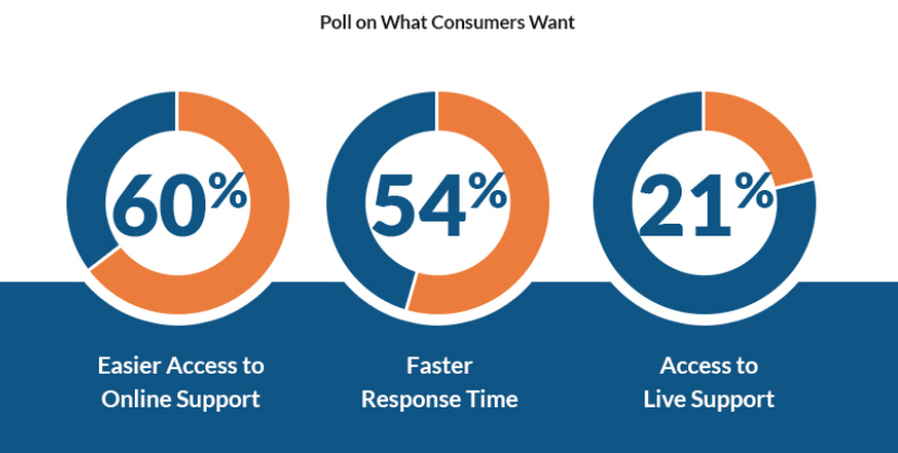
Needless to say, I was so frustrated that I didn’t end up buying the product. This isn’t surprising since the majority of consumers want easy access to online support.

image7 11

Don’t be like the company I had this awful experience with.

Make sure you have easy navigation on your website and a smooth checkout process. The less friction your customers experience as they go through the process, the less frustrated they will be.

Share your core values

Obviously, every company wants to make high profits. But that’s not the only reason why everyone is in business.

There are certain brands that have other missions that act as the driving force behind their goals. If this sounds like you, make sure you share these values and beliefs with your customers.

For example, are you affiliated with any charities?

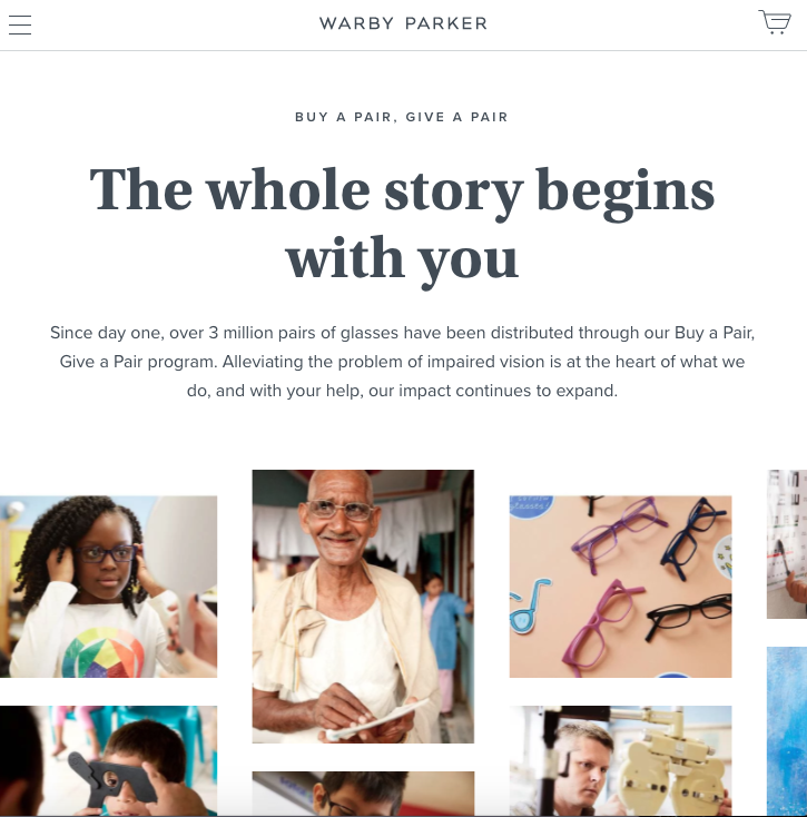
These types of core values can stimulate emotions within customers and ultimately lead to more sales. Here’s an example from the Warby Parker website:

image5 12

Warby Parker sells glasses. But that’s not all they do. Through their buy a pair, give a pair program, they have been able to donate more than three million pairs of glasses to people all over the world.

Not everyone can afford glasses. So this company does their part by helping those who don’t have the resources or access to eye care professionals.

This type of story can definitely help drive sales because of the emotional attachment to a purchase.

If their customers know their purchases will help someone in need, they will be more likely to buy from the company.

Stimulate desires

What do people desire?

Sex. Food. Sports cars, big houses, and beach vacations.

Incorporate these ideas into your marketing strategy. I’m not saying you need to tell people your product will help them get a new car. But you can still throw a fancy convertible into your ads to help grab someone’s attention.

Think about the last time you saw an advertisement for food on television. The camera zooms in on a cheeseburger and shows juices pouring down the bun.

Everything looks perfect, and it’s supposed to make you hungry. Your mouth might even start watering. Why? Because they are stimulating your desires.

Now you’re craving a cheeseburger, so you go out and buy one.

That’s how emotions of desires lead to sales.

Drive competitive energy

People are also competitive by nature. They are competing with their co-workers and friends, and are trying to “keep up with the Joneses” at home.

Apply this concept to your marketing campaigns.

For example, let’s say you’re selling lawn care products. You could create an ad that says something along the lines of, “Have a better lawn than your neighbor’s.”

Or if you’re selling sports equipment, you could explain how your products will give your customers an edge over the competition.

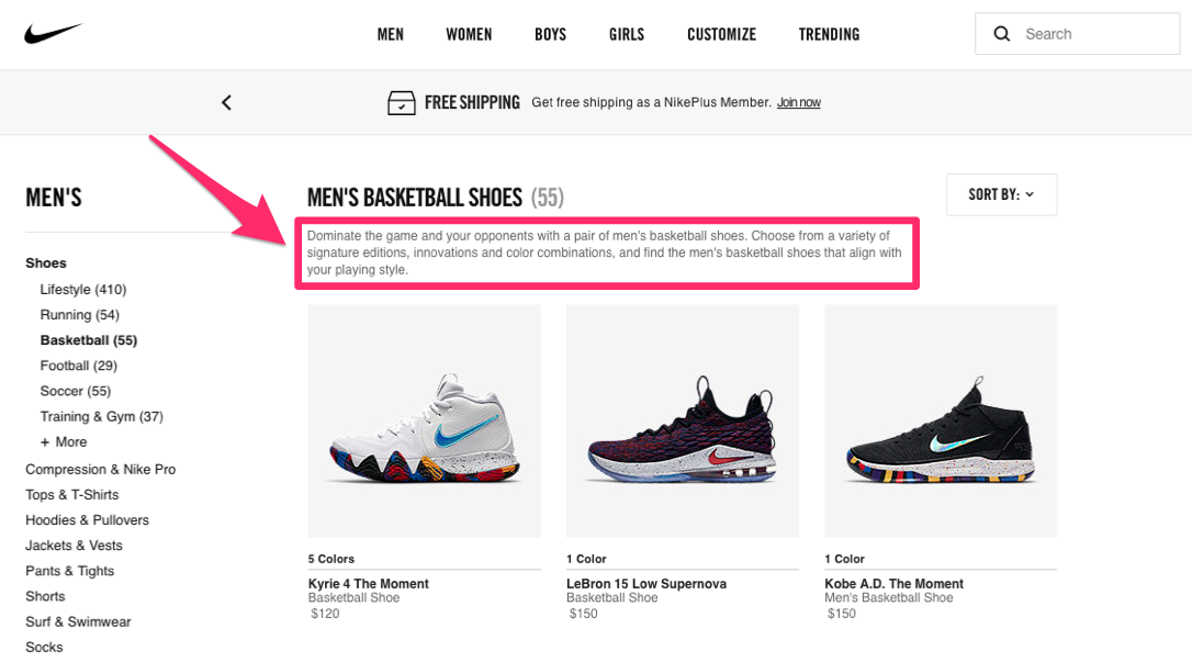
Here’s an example of how Nike uses this strategy to promote basketball sneakers on its website.

image4 12

They say these sneakers will help you dominate your opponents.

Such phrases can tap into the competitive nature of a customer. This emotional response can lead them to complete the purchase process.

Conclusion

Emotions are powerful.

As a marketer, you need to learn how to effectively stimulate emotions to encourage sales.

Use fear and greed to make your customers behave a certain way. Build trust with your customers, and create a community that establishes a sense of belonging.

Simplify the buying process to eliminate frustration. Share your core values, and proudly display any charitable donations.

Stimulate desires, and focus on the competitive nature of your customers.

If you follow these tips, you’ll be an expert at guiding people’s emotions to increase your sales revenue.

What emotional response does your marketing strategy generate?


from Quick Sprout https://ift.tt/2IK5kSR
via IFTTT
Monday, April 9, 2018

How to Quickly Identify What Is Killing Your Blog Conversions

Blogging is one of my favorite marketing tools. There are many benefits to blogging—that’s why all my websites have blogs.

But honestly, I enjoy it as well. Writing blog posts keeps your finger on the pulse and helps you stay connected with your audience. I’m not saying you have to be in love with it, but it definitely makes things easier if you like to write.

If you take care of your blog, your blog will take care of you in return.

Those of you who have a blog up and running are headed in the right direction. But if your posts are not generating leads or getting readers to convert, it’s a problem.

First, it’s a waste of your time. Think about all the time and effort you put into these posts. If nobody’s reading them or converting, you’d almost be better off not writing at all.

Second, it’s a huge missed opportunity. Blogging is basically free marketing. The only cost to you is your time writing.

If you can learn how to write content that converts, you’ll have a huge return on your investment.

The problem is people writing blog posts don’t know why their blogs don’t help them convert their readers. If this sounds like you, you’ll definitely benefit from this guide.

I’ve outlined how you can identify the elements, or lack thereof, on your blog that are crushing your conversion rates.

Once you recognize the problems, it should be an easy fix. Here are the factors you need to keep an eye on.

Infrequent posts

You can’t expect high conversion rates if you’re not constantly posting new content on your blog. Those of you posting only once or twice a month need to step up your game.

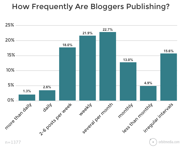
Here’s how often the average blogger publishes posts on their website:

image2 8

As you can see, the majority of websites publish a new post on a weekly basis or at least several times per month. That must be the best approach, right? Think again.

Although there is a higher percentage of bloggers posting at this frequency, it doesn’t mean it’s the best option.

In fact, 66.7% percent of bloggers who publish content more than once per day report strong results based on this frequency. Only 31.5% of bloggers who post on a weekly basis feel the same way.

So for the most part, it’s safe to say the more often you post, the better your conversions will be.

On average, it took bloggers 3 hours and 20 minutes to write a blog post in 2017. I’m not saying that’s fast, but it really isn’t that unreasonable.

Let’s say you work five days per week. Can you dedicate two hours a day toward writing? If you can find the time, that’s three new posts per week.

Try to start there and see what kind of results you get for the next couple of months. Posting more often increases the chances of you getting a steady audience of regular readers.

As a result, the increased traffic to your website and the growing number of people becoming familiar with your voice can lead to higher conversions.

Large blocks of text

Analyze your writing style for a second. If you’re writing huge paragraphs that are five, six, or even seven lines long, you’ll need to cut that down significantly.

You’re writing a post for a blog. Don’t think of it like a college research paper. Try to limit your paragraphs to just two or three lines at the most.

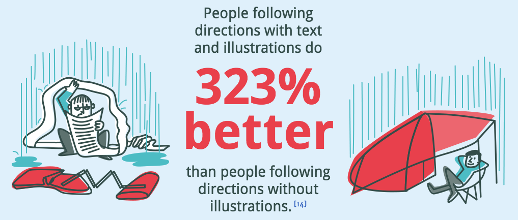
Add images to help break up your content and make the posts look more appealing. This strategy is highly effective if you’re directing your readers to do something:

image4 8

That’s because visual content is easier for most of your readers to understand. In fact, 65% of people are visual learners.

Images resonate with people. Adding them to your blog makes your content easier to comprehend and retain. As a result, you’ll get higher conversions.

If you’re currently writing large blocks of text, you can use my posts as a guide to help you change. Scroll through this post to see how short my paragraphs are and how I use images to let the text breathe.

Brief sentences and short paragraphs also make your content more conversational. This is much easier and more enjoyable for people to read.

Here are some other tips and tricks for breaking up your large blocks of text. Add bullet points and lists to your blog posts.

These will stand out on the page and make it easier for your readers to scan. Only 16% of people read blog posts word for word—79% of readers scan it.

Scannable posts will appeal to your readers, making it more likely they’ll consume more of your content.

Your call to action is unclear

What’s the purpose of your blog posts? If you don’t know the answer to this question, that’s probably why you’re not seeing high conversions rates.

How can your readers know what action you want them to take if even you don’t know what you want them to do? Go back to the drawing board, and come up with clear CTAs.

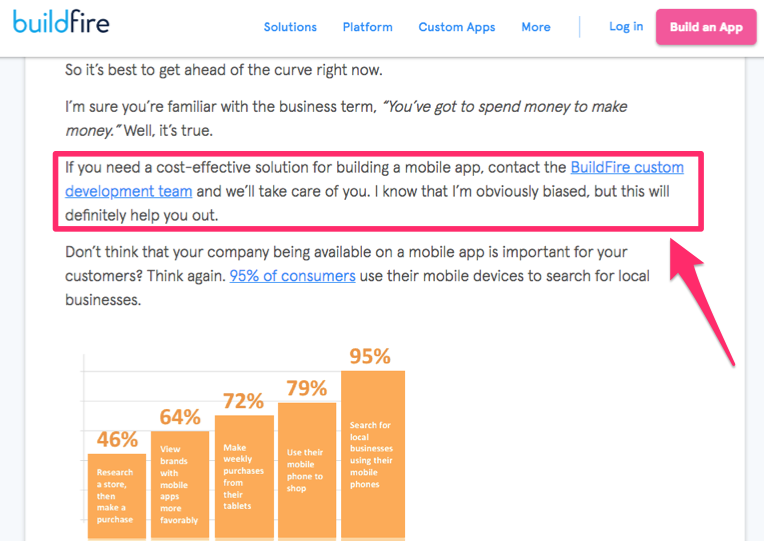
Check out this blog post written by Ian Blair at BuildFire:

image1 8

In this section of the post, Ian is talking about the fact that businesses need to spend money to develop a mobile application, which can be expensive.

He then offers a solution to the readers who may be looking for a more cost-effective way to build an app. He recommends they contact the BuildFire custom development team.

The CTA is set up perfectly, and he even hyperlinks the text so his readers can go directly to the contact page instead of having to search for it.

A quick side note. Notice how this blog post also includes short paragraphs and images to break up the content, which I have discussed above.

You can incorporate a clear CTA in your blog posts in many ways. You can follow the example above and work it into the text. Or you could  have large CTA buttons in the middle or at the end of your posts.

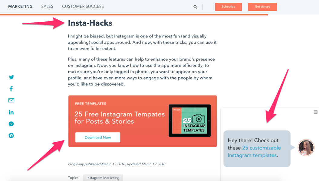
Here’s another example from a Hubspot blog post about Instagram marketing:

image6 8

There is a popup on the bottom right side of the screen that encourages readers to check out their customizable Instagram templates.

At the bottom of the post, there is another pitch for the same 25 templates. They are free, and the CTA clearly says, “Download Now.”

This is a great strategy because the blog post is about Instagram. It wouldn’t make sense to have these CTAs here if the content was about Facebook or Snapchat. A clear and relevant CTA will have higher conversion rates.

The content doesn’t speak to your audience

Take a minute to think about your website and brand. You already know how to identify your target market. Make sure your blog posts speak to this group of people.

For example, let’s say your company sells customized skateboards. Your target market is primarily teenagers and young adults living in Southern California.

You’ve got an ecommerce site as well so customers can place orders online. You add a blog to your website to try to get even more conversions. Great idea.

But it’s ineffective if your blog posts aren’t appealing to your target market. There’s no reason for you to be talking about household appliances or travel arrangements in your posts.

You may think that example is extreme, but you’d be surprised how off topic some blog posts from certain websites are. It’s shocking.

That’s because people seem to run out of ideas. They don’t know what to write about, so they pick a random topic or go off on a tangent in one of their posts.

This is a fast way to lose the interest of your audience.

Your blog isn’t mobile friendly

Did you know 85% of adults in the United States read news on their mobile devices? With mobile trends on the rise in 2018, your blog needs to be optimized accordingly.

People are viewing your website from mobile devices. It’s a fact. Ignoring this is a huge mistake that’s crushing your conversion rates.

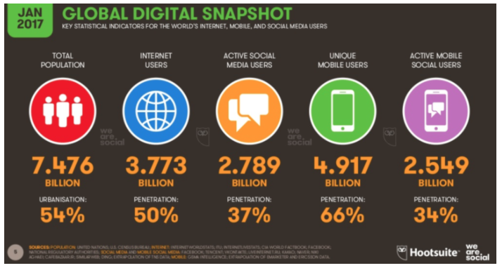
There are roughly 5 billion unique mobile users across the globe.

image7 7

If you don’t provide such a large group of people with an enjoyable reading experience, you risk alienating them.

Those of you who don’t have a mobile-friendly blog need to address it immediately.

In addition to optimizing your blog for mobile devices, you need to pay attention to your writing style. It needs to accommodate mobile users by offering them small bits of information at at time. Recall the earlier discussion about removing large blocks of content from your posts.

Five-line paragraphs on your desktop site will look twice as long on mobile devices.

You’re forgetting about Google’s algorithm

Understand the way people find your blog posts. You can’t expect that people visiting your website will automatically navigate to your blog.

You need your blog posts to be top hits on Google when people search for related terms. If they click on your posts after a search, you’ll increase your chances of getting more conversions.

To make sure you’re on the first page of Google’s search results, you’ll need to learn the basics of search engine optimization.

Posting new blog posts on a regular basis, which we discussed earlier, will definitely help you increase the rankings. You’ll also want to make sure you don’t have any broken links, errors, and large images, taking too long to load.

But one of the best ways to optimize your blog posts for Google’s search algorithm is with keywords.

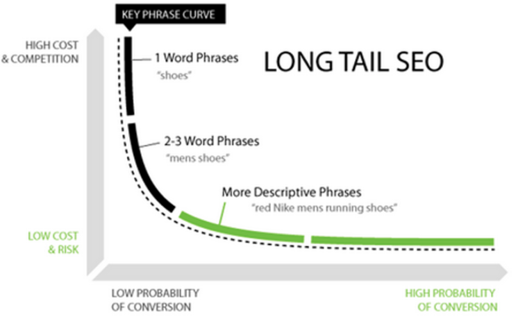
Think about the words or phrases people would type into a search bar. Include those keywords into your posts. Adding long tail key phrases increases your chances of getting higher conversions:

image5 8

That’s because when people search for something on Google, they typically use a phrase rather than one word.

In fact, the average number of words for an Internet search query in the United States is five words.

The more descriptive you can be, the more likely your posts will come up as top search results.

Your posts are not being shared on social media

Besides SEO, you’ll need to come up with other ways to drive more traffic to your blog posts. Social media websites are perfect for this.

The reason why I love sharing blog posts on social media is because it kills two birds with one stone.

First, you’ll get more traffic to your blogs.

But second, these posts give you an excuse to post new content on your social platforms, keeping your feeds fresh.

Post on a daily basis if you want your followers to stay engaged—that’s why this strategy is a no-brainer.

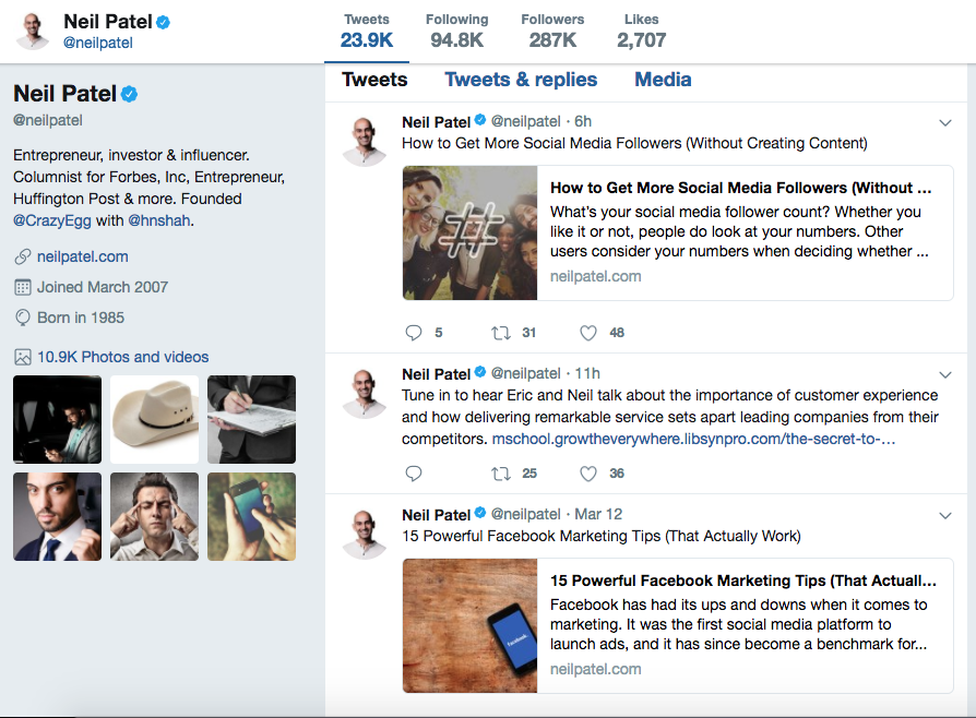
If you look at my Twitter profile, you’ll see I use this strategy to promote my posts:

image8 5

In addition to sharing these posts yourself, you should also encourage your readers to share your content.

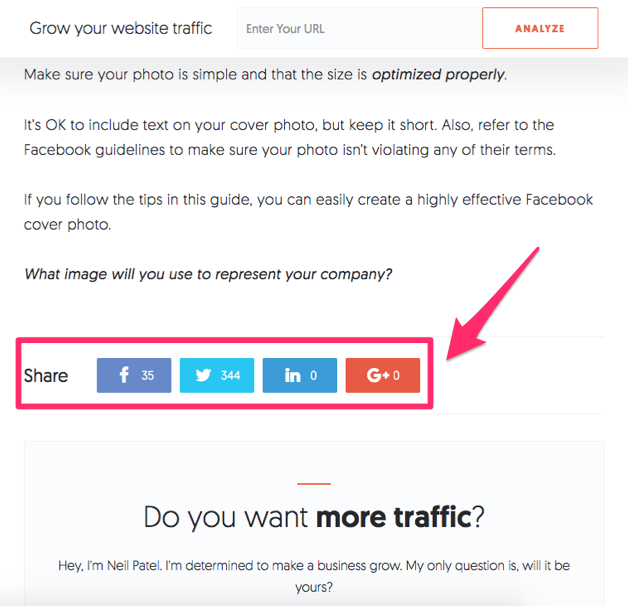
The easiest way to do this is by including social sharing links within your blog posts. That way, your content can be shared with just one click.

Here’s how I implemented this strategy on my website:

image3 8

Take advantage of your social media platforms. By driving more traffic to your blog posts, you’ll ultimately get more conversions.

Conclusion

Blogging is a great way to drive traffic to your website and increase conversions.

Those of you who are blogging but not happy with your conversions rates will need to make some changes.

Post more often, and get rid of large blocks of text. Make sure your content speaks to your audience and has clear CTAs.

Your blog posts need to be mobile-friendly.

Use keyword optimization to drive more traffic to your blogs.

Leverage social media platforms to drive more traffic to your blog posts as well.

Once you’ve identified what you’re doing incorrectly, it should be easy to fix these mistakes.

After you implement these changes, you’ll notice much higher conversion rates from your blog posts.

What elements of your blog need to be updated to increase your conversions?


from Quick Sprout https://ift.tt/2GLi7It
via IFTTT